CLOSE
BRAND
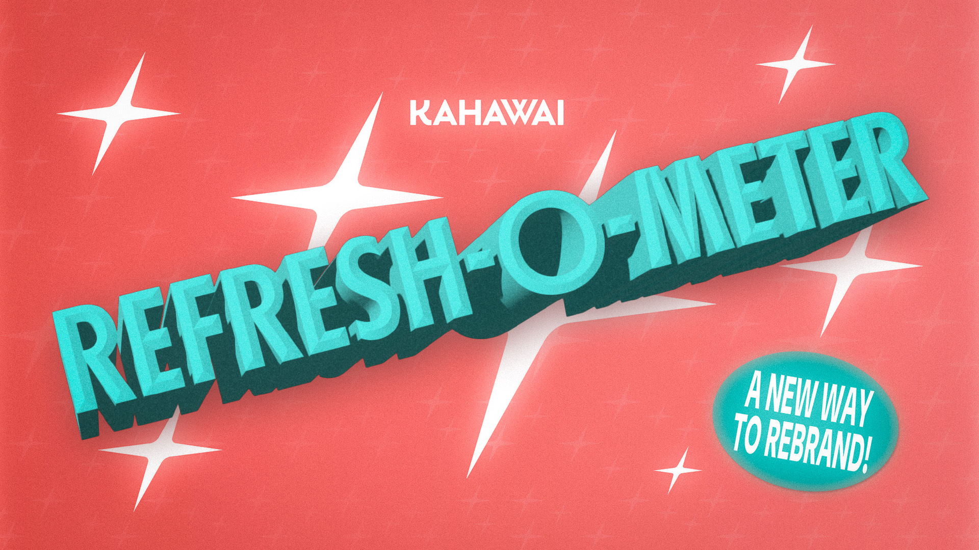
While not patented, the Refresh-O-Meter is a Kahawai method for approaching refreshing brands. With this approach, the client gets to visualize the potential of their brand on a spectrum of 1-4 levels of refresh.
August 1, 2025
4
minute read
How do you try something new without scaring off the client? How do you communicate the important decision a company has between keeping changes only slight, versus being risky with a totally new direction?
While not patented, the Refresh-O-Meter is a Kahawai method for approaching refreshing brands. With this approach, the client gets to visualize the potential of their brand on a spectrum of 1-4 levels of refresh.
Refresh Level 1: “If It Ain’t Broke”
Refresh Level 2: “Familiar But Fresher”
Refresh Level 3: “Comfortably Shape-Shifting”
Refresh Level 4: “The Freshest Refresh”
Do they want to keep it close to home with just a slight refresh? Do they want to push the meter all the way to the top to make the company really stand out? Or does it fall somewhere in the middle?
If this method seems appropriate for a client, then it’s a great way to show some of the bolder concepts that otherwise would’ve been forgotten in an Illustrator file somewhere.
Here’s how they work in practice, using a recent Kahawai project as an example:

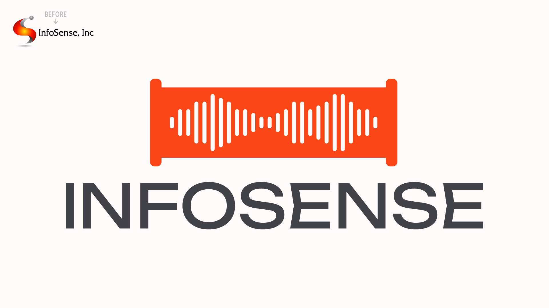
Refresh-O-Meter level 1 is for brand visuals that stay extremely faithful to the original, but with some interpreting of the client’s needs to help make it feel “fresh” to them in the most subtle ways we can.
This shouldn’t just be the infamous brand agency decision to flatten and minimize the logo, it should be to take what already worked and make it work even better for them.

Some brands just don’t make sense to completely revolutionize. Maybe they are a legacy brand whose colors, logo, and voice all are core to their identity. Maybe they are a beloved local business with community recognition. Whatever the reason, it may be nice for the client to see levels 2-4 to know what they don’t want and come to this conclusion themselves.

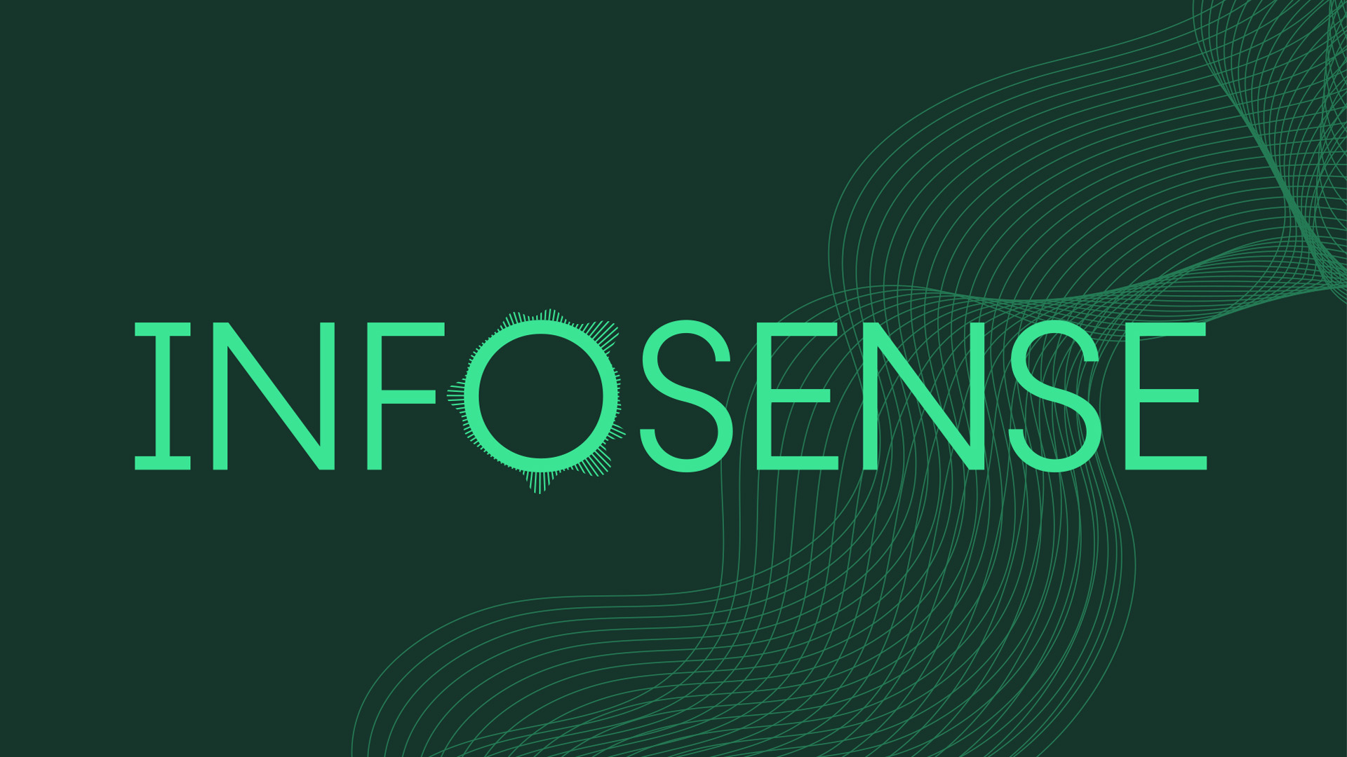
Refresh-O-Meter level 2 is for brand visuals that want to keep an important part of the core of the brand, but with a little extra touching up.

Level 2 will almost certainly keep the same general icon, illustration, or type style in the logo, but perhaps redone with a new designer’s eye.
Example: An “S” monogram stays an “S”, a cat logo stays a cat, just a new interpretation.

Refresh-O-Meter level 3 is for brands where the original was missing communicating something essential to the brand identity, and it needs to be changed.
Level 3 pushes the brand itself out of its comfort zone, but is still fairly safe as far as modern brand design goes. This gives the client an opportunity to see something quite different, but remains fairly universal as far as taste is concerned.

Refresh-O-Meter level 4 is for brands who want something really bold and adventurous. The goal with level 4 is definitely standing out, and potentially even growing attention created by the bold branding choice itself.
While this is the least commonly chosen layer of the Refresh-O-Meter by clients, it does a few important things for the presentation:
There’s no wrong choice for a client to make with the Refresh-O-Meter, and the goal is not to push them in the riskiest direction possible. But with the help of the patent-not-pending Refresh-O-Meter, the client can be guided through a few wholly unique ways to view their own brand.
At Kahawai, we’ve seen a lot of success in the Refresh-O-Meter method, both on the end of the client and for the marketing team. It provides a great way to explain the thought process of a brand refresh and avoids showing a client the same idea 4 times and expecting them to choose between 4 nearly identical shades of beige.
And that’s the Refresh-O-Meter!

For more on the topic of avoiding bland design, read these other Kahawai blogs:
How Minimalism Sometimes Removes More than Just Clutter
A cow, a cat, and a mouse walk into a marketing company

